This is our feedback on our ancillary products.
Showing posts with label Mercedes Sayles. Show all posts
Showing posts with label Mercedes Sayles. Show all posts
Monday, 30 April 2012

Friday, 20 April 2012
Interim evaluations of work achieved - Chloe Alldis
Main Product.
Our music video took us a fairly long time to make as it consisted of us choosing shots, editing them and adding in transitions. We also spent a lot of our free time completing this until be believed it was perfect. When planning our video we knew we wanted a narrative genre. However we decided that it would be a good idea to also contain the aspects of a performance based video, therefore creating a video that was effective for the viewers.
Ancillary Products.


When we came to create our ancillary products, we knew that they had to link in well with our music video. With this in mind we chose colours, text sizes and fonts, images, and layouts very carefully. For our magazine advertisement we kept it fairly simple yet effective in the sense that the image says it all about our genre of music. The girl is standing in front of a lake by herself, which gives the impression to the listeners that our music is relaxing, yet somewhat a type of music you would chose to listen to by yourself, linking in with our idea of a break up.

 The front cover of our digipack four images, two of the whole band 'Reminiscence' and two of the singer herself. Here we have kept the font of the bands name the same as the font in the magazine advertisement, this is because we wanted the to relate and for listeners to see the font and instantly know the band.We used a font that resembles writing as we thought it looked more personal and fitted in with our genre well.
  The back cover of our digipack again uses the same font as the magazine advertisement, however this time for the album title. This type of font, we believed looked quite quirky and again personal as it almost looks handwritten. We used swirls in just one corner, this was to show that our target audience is females, and the swirls represented 'love' to link in with the idea that swirls and fireworks are how you feel when you are in love. For the main image we decided we wanted to do something a different, this led to us choosing to have a black and white background with just one dominant colour showing, in this case it was her bright red dress which stood out the most. We believe this is effect as it draws the audiences attention to the image. We also used a red dress as it is associated with 'love' therefore it links in with our genre.

 The inside of our digipack, behind the CD, we chose to have a heart made out of hands. This was purely because we believed it would have an impact on the reader as they took the CD out of the case. It could also have a meaning to the listener, making them remember the good times they have shared with loved ones. We have also used a quote so that people can relate more and also remember the band themselves.
 For the inside of the digipack we chose to have the whole band together laying in the road. However having the picture itself in a more vibrant colour such as blue, gives the effect of 'sorrow' and perhaps an album that might shed a tear. This also links in again with the target audience. We have used another quote in this part of the digipack as well as writting our 'thank you's' to those who helped make our music video a great success.
CHANGES
We decided that our ancillary products do not work well with our genre or music. We also discovered, after receiving our audience feeback, that we didn't have a clear brand identity, therefore we changed the whole of our Digipack. We decided that vibrant autumn colours would aid our audience to understand our message of a 'journey', without us spelling it out. We also used more technologies such as the Green Screen and Photoshop. We retitled our album 'The Odyssey' as it had more impact and related more to our genre of music. The images that we have used we taken to show a deep connection between the artist and the audience, a way of connecting past or present experiences. The idea of the album is to not know what the future holds, and the digipack reflects this and our main song 'Just a taste'. We have changed our font and made it more dominant, as we discovered, after much research that artist use dominant bold fonts to sell their music. Each part of our digipack links to one another through different messages. Such as the front cover and the back cover, being linked but the fallen autumn leaves.


Thursday, 19 April 2012
Digipack Analysis
This is our digipack analysis where we analysed different digipacks from both our genre and others.
Chloe Alldis
Monday, 9 April 2012
Synopsis Planning

-Mercedes Sayles


Friday, 6 April 2012
Magazine Advertisement Analysis

The White Stripes advert is very simple, yet effective. They use only 3 colours: Black, white and red; which links closely with the name of the band. The main part of the advert is a photograph of them, in which, again the band are only wearing black, red and white and are against a plain white background. The font is block capitals, the band's name in white with a red text box around it, the album name is underneath in white and slightly smaller than the band name. They also have a picture on the album cover in the middle of the text area and the image area, which shows people what they are looking for. The advert is effective because the main focus is the photograph and the only written information given is what the viewer needs to know.

This magazine advertisement has three colours, white, black and violet - which is relevant to the title of the album 'High Violet'. The image on the advert is the album cover, which is very plain with a white background and a grey pattern. The bottom half of the advert is just text, about the album itself, when it is available etc. The biggest piece of text (apart from the title) is in the middle and tells the reader the availability date. This advert resembles a gig poster, which is quite a clever way of displaying the information about the album and in this way it can be said to be effective. However, this advertisement is hardly eye catching due to the lack of image and too much text. Unless you were a fan of this band it would be unlikely you would stop to look at it.
 This advertisement is for Bruce Springsteen's album 'The Promise'. The colours used in this are extremely dull- Grey, black and white. The only thing in colour is the HMV logo at the bottom, showing readers where they can buy it. The whole advert's background is the image of Bruce Springsteen standing next to a car, on a long road surrounded by nothing. This could be representative of his journey throughout his life as he has had a long career. Again, with this advert, if you were not a Bruce Springsteen fan it is unlikely that you would stop flicking throught the magazine to look at it. The Artist's name and album name is all in one line in the same colour and same font, therefore the artist and album name does not immediately jump out at you.
- Maddie Tester
Tuesday, 27 March 2012
Health and Saftey
During our music video we may come across many different Health and Safety issues, we have to make sure that we are fully aware of what is around us and how to deal with it whilst filming. We have four places in which we will be filming; St Peters School for green screen shooting, NewLands Corner, A House for bedroom and a few other shots and The Beach. There are different thing we will have to be careful for, whilst using the green screen, we must make sure everything is safely attached and not in the way of anything or anyone to course potential harm or damage. Whilst at NewLands Corner we must make sure we are not in the way of the general public to cause annoyance and the weather could also be a problem here, we must make sure we are equipped if we suddenly have rain. Also NewLands Corner is very hilly and uneven we must make sure we are careful with equipment, not to drop or break it whilst filming. When filming in a house or bedroom, there are not many problems that will occur but the normal checks just to make sure nothing is in the way when filming and the equipment and everyone is safe. At the beach we must make sure that the equipment doesn't get wet either from the potential rain or water from the sea, also to make sure sand doesn't affect the equipment and that all of the actors are safe if entering the water, also the general public, we must be aware of them and to make sure we don't cause annoyance again. These are the general Health and Safety procedures we just have to make sure we follow them and we will be safe whilst filming.


- Mercedes Sayles

- Mercedes Sayles
Sunday, 25 March 2012
Record company name/profile logo

The music industry, a record label is a brand and a trademark associated with the marketing of music recordings and music videos. There are many different record label's all over the world for all types of genre within the music industry for example;Polydor, Island, Sony, Def Jam, Big Machine Records, Syco, Universal and Warner Brothers. We have decided to use the record label company Big Machine Record because this is the company that signed Taylor Swift and she is are inspiration and role model throughout so we are going to stick by her and go for the same record label company, also they specialize in our chosen genre of county music so it would be prefect.
Big Machine is based in Nashville, Tennessee, and is distributed by Universal Music Group. The label has one Grammy for Album of the Year, awarded to Fearless from Taylor Swift.
In November 2007, Big Machine Records founded a subsidiary imprint called Valory Music Group. Acts signed to this roster include Jimmy Wayne (who was formerly signed to Big Machine), Jewel, and Justin Moore. By late 2008, the label began promoting Canadian acts Adam Gregory and Emerson Drive, who are also signed to Midas Records. Big Machine ended promotion for the two artists in 2009. Reba McEntire joined Valory in 2009, in association with her own label, Starstruck.
Big Machine joined with Universal Republic in June 2009 to found a new label, Republic Records Nashville.


-Mercedes Sayles
Thursday, 15 March 2012
Costume Planning


This will be the complete outfit worn by the lead singer and female actress when singing on green screen only. A printed white t-shirt with a guitar, brown boots and dark blue skinny jeans. We decided to chose this because our music type is indie/pop/country and this is a typical outfit that a female teenager would wear and also goes with our video with the use of a guitar and this is why we decided on the chosen t-shirt. Worn by Mercedes Sayles.


This will be the complete outfit worn by the lead singer and female actress when singing when shooting the beach and Newlands corner scenes. A printed white t-shirt that says "To be or not to be that is the question" William Shakespeare inspired, white converses and light blue skinny jeans. We decided on this outfit because it fits the mood of a romantic love scene or break up. The t-shirt shows both sides just like our music video. Also its just a casual outfit and this is what we want, a normal everyday outfit with a bit of an edge and we believe that the t-shirt will because of showing both side to a love story just like William Shakespeare did. Worn by Mercedes Sayles.


This could be the outfit worn by the backing singer/guitar player and other female actress. Three possible dresses very girly made of lase and very natural colours, with black leggings and flat ballet pumps. We decided on possible using these as an outfit because we want her to look girlie and more attractive than the other female actress showing the audience that she has the edge and she will win the love interest also so it shows her as innocent. Worn by Chloe Alldis.


This could be the outfit worn by the love interest. Smart shirt, branded t-shirt pale/dark jeans and red/black and white vans. We decided on possible using these as an outfit because we want him to look stylish and attractive as he is the love interest and this is a very typical teenage male outfit, also its casual/smart and this is the effect we want, we need him to look good and appealing. Worn by Jamie Barnes.
- Mercedes Sayles
Tuesday, 13 March 2012
Convention Of Our Genre

 Our music video genre is very popular in this day and age and the 'Kelly Clarkson' video 'Mr Know It All' portrays what we have been planning especially. It has many shots that we are using and the edgy performance that she shows is what we want our music video to look like and make the audience feel.
Taylor Swift

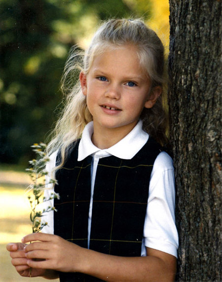


We have done a lot of research in our genre of music and the best artist that we have found that best fits with our chosen song is Taylor Swift. Her music is very similar to ours, it is county pop and uses a guitar very heavily. The videos are mainly narrative with a hint of performance. They are also very personal to Taylor and she tends to write about personal experience. The video 'Mine' is a personal love story about a break up and make up. The video focuses on past experiences of being a child and watching her parents break up and she feels she will go though the same thing. The video has lot of close up on photos hanging on a line in the trees and as the pictures are focused on, it relates to the lyrics. The video has been very carefully put together and its like a mini story almost. Taylor Swift has very precise videos, she knows what her audience likes and she delivers similar all the time. Her target audience is mainly females in the teenage bracket and this is why she try's to make her videos as relate able as she can. She try's to cover story's that younger people go though everyday so people find it easy to relate to her music videos.
-Mercedes Sayles
Monday, 20 February 2012
Location shots
We have a wide range of location shots for our music video our main location will be Newlands corner

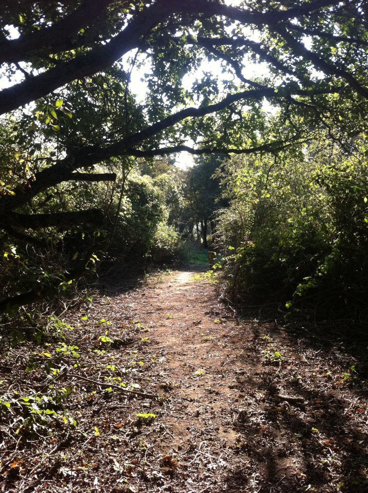


 Our other location shots include a beach and a bedroom also the room we will be using to shoot on the green screen.


- Mercedes Sayles
Subscribe to:
Posts (Atom)